
Why Mobile-First & Responsive Design Decide Your Business Growth
In today’s digital marketplace, mobile-friendly websites are no longer an option they are a necessity. Your website is like your shopfront, your salesperson, and your visiting card all in one. But if it looks broken or clumsy on a mobile screen, it’s like serving chai without sugar customers won’t stick around.
For most people, their phone is their lifeline. From booking cabs on Ola to paying vegetable bills with UPI, everything happens on that little screen. If your business doesn’t appear neat and usable there, you might as well be invisible. This is where mobile-first and responsive design decide your growth. They are the real game-changers, ensuring your website attracts, engages, and converts users no matter where they are or what device they hold.
Mobile: The New Default Screen
Not long ago, people fired up desktops to check websites. Today, mobile is the default screen. More than 70% of India’s internet traffic comes through smartphones. That means your customer is likely scrolling your site while sitting in a metro, sipping chai at a dhaba, or waiting for a bus. If your site doesn’t display well, don’t expect them to “check later on laptop.” Later never comes.
This is why businesses that invest in mobile-friendly websites are winning the race.
What is Mobile-First Design?
Mobile-first design means starting your website layout with mobile in mind before scaling it up for larger screens. Instead of squeezing a big design into a small box, you first design for the small box. It’s like planning a wedding feast: first serve the crowd (mobile users, the majority), then prepare something extra for VIP guests (desktop users).
This approach ensures fast-loading content, big thumb-friendly buttons, and a smooth mobile experience essentials of truly mobile-friendly websites.
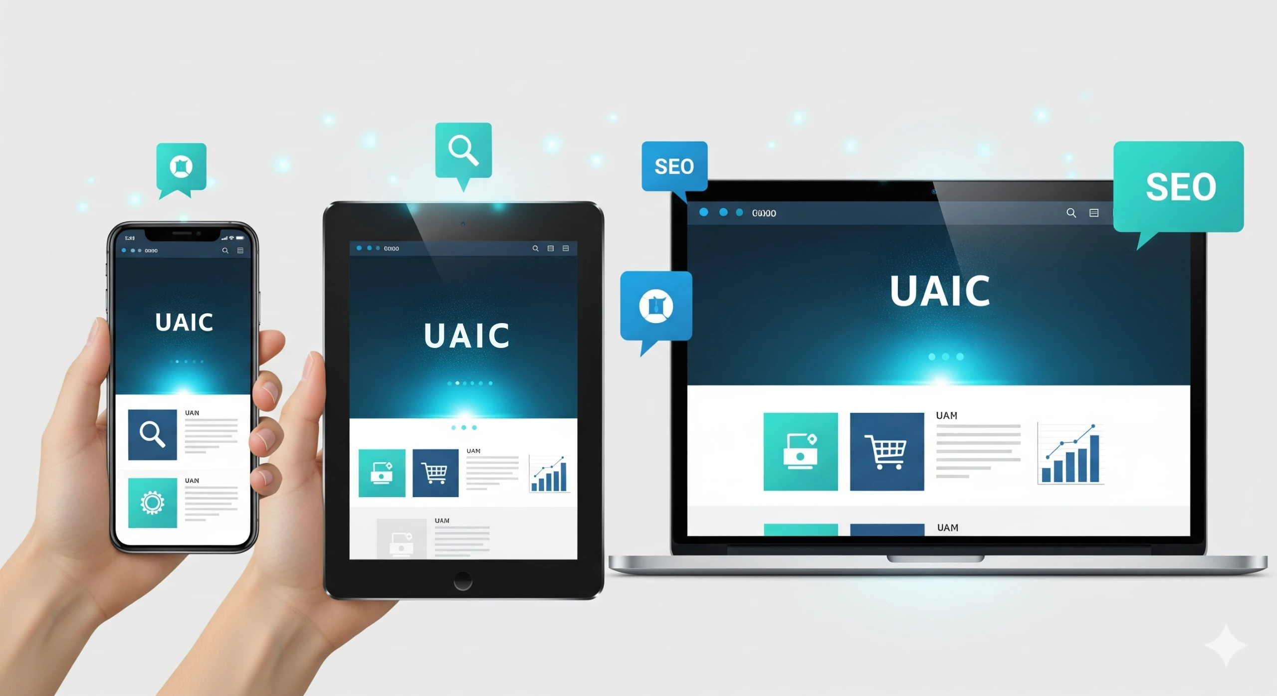
What is Responsive Design?
Responsive design makes a website adjust automatically to different screen sizes. Whether a user is on a budget Android, an iPad, or a giant desktop, everything looks neat and fits perfectly.
It’s like tailoring a kurta that suits every body type. No pinching or zooming required.
For businesses, this consistency builds trust. A responsive website is always a mobile-friendly website, no matter what device your customer uses.
Why Mobile-Friendly Websites Decide Business Growth
1. First Impressions Create Trust
Would you buy from a shop with broken shelves? Of course not. Similarly, a poorly designed mobile site immediately makes users lose confidence. A well-structured mobile-friendly website creates instant trust. And in business, trust is half the battle.
2. Google Prefers Mobile-Friendly Sites
Google is the headmaster of the online world it decides who comes first in search results. And Google openly rewards mobile-friendly websites. If your site isn’t mobile-first, it will sink in rankings like a stone in a pond. Better ranking = more visibility = more customers.
3. Higher Conversions, Less Frustration
A smooth mobile experience means customers are more likely to buy products, book appointments, or fill out forms. On the flip side, a clumsy site is like asking someone to write with their wrong hand irritating and slow. They’ll simply quit.
Mobile-friendly websites reduce friction and increase conversions.
4. Wider Reach Across Bharat
India’s internet growth is powered by mobile phones, not laptops. From metros to small towns, everyone has a smartphone in hand. Even your rickshaw-wala bhaiya is checking fares online.
By creating mobile-friendly websites, businesses tap into a much wider audience, including first-time internet users.
5. Stay Ahead of Competitors
If your competitor’s site works smoothly on mobile and yours doesn’t, the customer won’t think twice. It’s like two pani puri stalls side by side one serves cleanly and quickly, the other struggles with dirty bowls. Where will the crowd go? Exactly.
Investing in mobile-friendly websites is a direct competitive advantage.
The Indian Consumer Mindset
Indians are value-conscious and impatient when it comes to digital experiences. If your site takes more than three seconds to load, “khel khatam, dukaan band” (game over, shop closed).
Mobile-first and responsive design match this mindset by ensuring:
- Quick load times (saves data).
- Simple navigation (no confusion).
- Clean responsive design (respects the user’s time).
When customers feel respected, they reward you with repeat visits and word-of-mouth promotion. That’s how mobile-friendly websites fuel real business growth.
Real-Life Examples
- A Jaipur mithai shop updated its site into a mobile-first, responsive design. Suddenly, Rakhi and Diwali orders flowed in through mobile, boosting sales by 40% in just three months.
- A tuition teacher in Lucknow set up a mobile-friendly booking page. Parents could reserve slots from their phones without hassle. The teacher’s classes filled up, and paperwork reduced.
Even small businesses can grow big by going mobile-first.
Common Mistakes to Avoid
When chasing mobile-friendly design, many businesses slip. Some blunders include:
- Using heavy images that slow down load times.
- Tiny buttons that make users feel like surgeons.
- Too many pop-ups like Delhi traffic, irritating and endless.
- Not testing across different devices.
Avoid these, and your mobile-friendly website will shine.
The Future of Mobile-First in India
With 5G spreading across India, websites will need to handle faster speeds and heavier content. Rural areas are also adopting mobile internet rapidly. That means the next wave of customers will discover your business not on a computer, but on a simple smartphone. Only mobile-friendly websites can capture this market.
Final Thoughts
Your website is your digital handshake. If it fails on mobile, it’s like offering a weak handshake people instantly lose confidence. Mobile-friendly websites powered by mobile-first and responsive design decide whether your business grows or falls behind. They impact customer trust, Google rankings, conversion rates, and competitive standing.
In short, going mobile-first is not a fancy option it’s survival. Businesses that act today will reap rewards tomorrow. Because in the digital world, the early bird doesn’t just catch the worm it catches the whole market.
If you’re serious about turning your website into a real growth engine not just a digital brochure, Contact Ozrit for Website Development. Let’s look at your site together and see where the leaks are. No hype, no jargon, just clarity on what’s working and what’s costing you business.
FAQs on Mobile-Friendly Websites
1. What does a mobile-friendly website mean?
It’s a website that looks neat and works smoothly on any smartphone or tablet without zooming or pinching.
2. Why are mobile-friendly websites important for business growth?
They keep customers engaged, improve sales, and help your site rank higher on Google.
3. How does Google rank mobile-friendly websites?
Google uses mobile-first indexing and gives higher ranking to sites that are mobile-friendly.
4. How can I check if my website is mobile-friendly?
You can test it on different phones or use Google’s free Mobile-Friendly Test Tool.
5. What is the difference between mobile-friendly and responsive design?
Mobile-friendly means good on mobile, while responsive means it adapts to all screen sizes.
6. Does having a mobile-friendly website cost a lot?
No, most modern website builders include it by default, and it’s a small investment for big growth